For the longest time, I would load money onto my Starbucks app in $15 increments. Every time I had to, I always thought, “Man, I wish I could reload a smaller amount; I just need a few extra bucks to pay for this drink.”
Imagine my surprise when I found out there was a $10 option and all I had to do was look at the drop down menu. It’s not that big of a difference, but for a college kid, five bucks is five bucks.
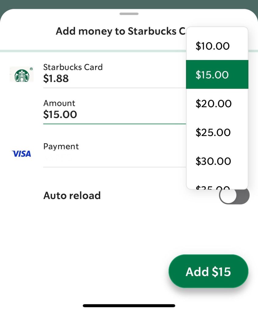
I assumed $15 was the lowest it went because it was the default option. I should’ve known better.
I was reminded of my frustration this week when I learned about behavioral economics and how specific default options are meticulously set due to the likelihood that the user will leave it where it’s at… just like I had.
As both a user and designer, I like to think I know why certain components are used to entice a user into purchasing or subscribing, but behavioral economics has taught me new ways I never considered.
Some Principles of Behavioral Economics
To give a better idea of what some of these methods are, I’ve listed a few principles that apply to interface design and marketing.
Anchoring deals with the first fact or number a user comes across and its ability to set a precedent for possible decisions made later. This is likely the first impression a user has with a product or service.

Defaulting, AKA my demise, is when a certain parameter is set as the default option to promote a user’s decision. Think about when you’re at a self-serve kiosk and the option to tip pops up; sometimes, the highest percentage is pre-highlighted hoping you’ll notice it first and click it before reviewing the other options.
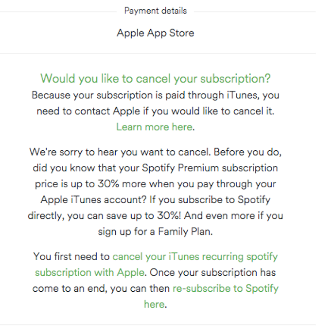
Friction Costs refer to any obstacle, big or small, that may deter the user from completing their task or order. Maintaining a streamlined process is important for the designer to keep in mind when ideating. On the contrary, adding friction to the process of canceling an order or subscription can also deter a user from completing the task.
Social Proof uses the power of group mentality to urge a user into participating or buying an item in order to keep up with others. Think of the “Got Milk” ads of the 2000s or any website encouraging you to “join the millions of others just like you.”
The Power of Free is exactly how it sounds; marketers use the word “free” to capture a user’s attention and give them a hit of dopamine, which increases the chance of them purchasing an item simply because they receive something free with it.
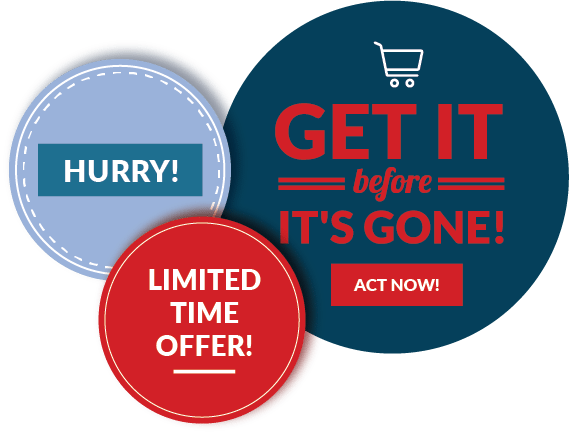
Scarcity gives users the idea that a product is more valuable because it’s exclusive or rare. Seasonal items are a prime example of this method. You better get your hands on it while supplies last!
Framing, which is similar to anchoring, is when a designer highlights a product in a certain way to tap into a user’s emotions.
Choice Paradox is the idea that providing more options does not equate to a higher rate of sales. Having too many options presented at once can be overwhelming to a user, so sticking to a few simpler options helps reduce decision anxiety.
The role of behavioral economics in design is about creating experiences that not only meet functional needs but also align with how users actually think and behave. By leveraging principles like the ones above, designers can craft more intuitive, persuasive, and engaging products. However, the application of these insights must be ethical, ensuring that design strategies serve the best interests of users while fostering trust and long-term value. There is a fine line between persuasion and being overbearing. As designers continue to integrate behavioral economics into their practices, they can help shape experiences that drive better outcomes for both users and businesses alike. As users, it’s important to understand what principles are being used and how it affects your choices.

Leave a comment