
Infographics play a crucial role in facilitating the understanding of a topic by combining visual elements with textual information. In today’s fast-paced, information-rich world, we are increasingly required to process large amounts of data quickly. However, information presented in tables or lengthy reports can be overwhelming and difficult to interpret. Because of this, it’s crucial for science communicators to find ways to connect with a wider audience through compelling visuals. Infographics can simplify topics by distilling advanced ideas into a concise visual form; their easily digestible formats make key insights more accessible and memorable to viewers of different backgrounds.
One of the main advantages of infographics is their ability to convey a lot of information in a concise space. Using charts, graphs, icons, and illustrations, infographics transform raw data into visually appealing formats that help guide the viewer’s attention to the most important parts, helping them to focus on the core message without becoming bogged down in the superfluous details.
Another key benefit of infographics is that they cater to different learning styles. Some people are more text-oriented and prefer written descriptions, while others are more visually inclined and grasp concepts better through images. Infographics blend both textual explanations with visual cues, making them an effective tool for a wide audience, regardless of their learning preferences. Additionally, the use of color, shapes, and symbols in infographics can evoke emotions and reinforce the message, making the information more engaging.
The story an infographic tells should feel relevant for the audience to make a meaningful connection. This helps turn your infographic into more than just data on a page. When introducing an idea, the 5Ws (when, where, who, what, and why) of a story structure is a wise place to start. By introducing your audience to the basics of the topic through a familiar format, they can connect with the information and retain the details easier.
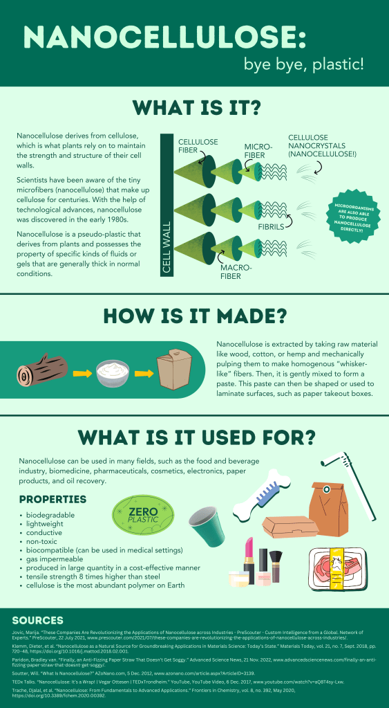
In my infographic below, I focused on the topic of nanocellulose, a plant-derived substance that acts as an impermeable barrier, similar to plastic. Most of the sources pertaining to nanocellulose are academic journals or complex scientific illustrations. To cater to a wider audience, I focused on what the substance is, how it is made, and what it can be used for. This provides a simple overview of the topic that can be understood by a large audience. I chose cool tones in an analogous color range to support the material’s environmental benefits and to unify the work as a whole.
Infographics are a great tool to use when presenting complex information to make it clearer, more memorable, and accessible. They simplify the communication process, cater to various learning styles, and offer an engaging way to present data that resonates with audiences of all backgrounds.
Sources
Cao, Jerry. “Web Design Color Theory: How to Create the Right Emotions with Color in Web Design.” TNW | Tnw, 7 Apr. 2015, thenextweb.com/news/how-to-create-the-right-emotions-with-color-in-web-design.
Jovic, Marija. “These Companies Are Revolutionizing the Applications of Nanocellulose across Industries – PreScouter – Custom Intelligence from a Global Network of Experts.” PreScouter, 22 July 2021, http://www.prescouter.com/2021/07/these-companies-are-revolutionizing-the-applications-of-nanocellulose-across-industries/.
Klemm, Dieter, et al. “Nanocellulose as a Natural Source for Groundbreaking Applications in Materials Science: Today’s State.” Materials Today, vol. 21, no. 7, Sept. 2018, pp. 720–48, https://doi.org/10.1016/j.mattod.2018.02.001.
Montalto, Mike. “Worth 1,000 Words: The Four Principles of Visual Storytelling.” Amplifi, 12 May 2022, amplifinp.com/blog/4-principles-visual-storytelling/.
Paridon, Bradley van. “Finally, an Anti-Fizzing Paper Straw That Doesn’t Get Soggy.” Advanced Science News, 21 Nov. 2022, http://www.advancedsciencenews.com/finally-an-anti-fizzing-paper-straw-that-doesnt-get-soggy/.
Patel, Neil. “12 Infographic Tips That You Wish You Knew Years Ago.” Neil Patel, 15 Feb. 2019, neilpatel.com/blog/12-infographic-tips/.
Patel, Neil. “The Complete Guide to Designing Stunning Visual Content (Even If You’re Not a Graphic Artist).” Neil Patel, 30 Aug. 2021, neilpatel.com/blog/the-complete-guide-to-designing-visually-stunning-content-even-if-youre-not-a-graphic-artist/.
Rodríguez Estrada, Fabiola Cristina, and Lloyd Spencer Davis. “Improving Visual Communication of Science through the Incorporation of Graphic Design Theories and Practices into Science Communication.” Science Communication, vol. 37, no. 1, Dec. 2014, pp. 140–48, https://doi.org/10.1177/1075547014562914.
Soutter, Will. “What Is Nanocellulose?” AZoNano.com, 5 Dec. 2012, http://www.azonano.com/article.aspx?ArticleID=3139.
Stout, Tim. “How to Use 3-Act Story Structure in Comic Strips.” Tim Stout, 3 Sept. 2011, timstout.wordpress.com/2011/09/03/how-to-use-3-act-story-structure-in-comic-strips/.
TEDx Talks. “Nanocellulose: It’s a Wrap! | Vegar Ottesen | TEDxTrondheim.” YouTube, YouTube Video, 6 Dec. 2017, http://www.youtube.com/watch?v=aQ8T4sy-Lxw.
Trache, Djalal, et al. “Nanocellulose: From Fundamentals to Advanced Applications.” Frontiers in Chemistry, vol. 8, no. 392, May 2020, https://doi.org/10.3389/fchem.2020.00392.

Leave a comment