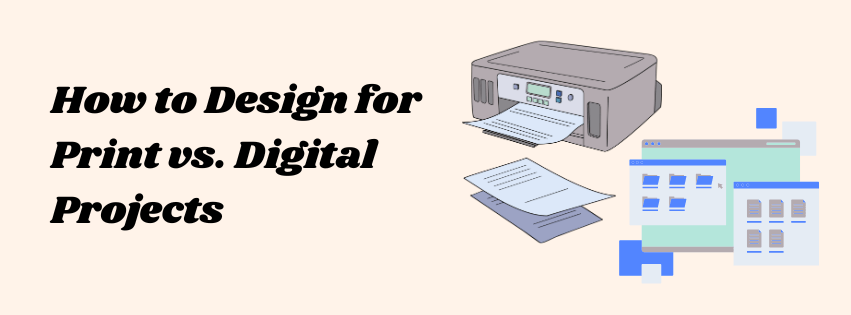
As a graphic designer, you’ll often find yourself creating designs for two very different mediums: print and digital. While the basic principles of good design apply to both, there are some distinct differences between the two that can make or break your work. Understanding these differences is essential for producing designs that not only look great but also function well within their intended platform.

Print:
In the world of print design, resolution is crucial. Print materials require a high resolution that’s typically 300 Dots Per Inch (DPI) to ensure crisp, clear images that won’t appear pixelated when reproduced on paper. A low-resolution image will look great on a screen, but when printed, it can become blurry or grainy. Because of this, you should always use high-quality images and graphics for print to maintain professionalism and clarity.
Digital:
For digital design, resolution matters less because screens are based on pixel dimensions rather than print resolution. The most common screen resolution for web design is 72 DPI, and images are typically optimized to load quickly while maintaining visual quality. However, with high-definition screens, the resolution might need to be higher. Designers often opt for 150–200 DPI for digital images to ensure they look sharp on all devices.
Print:
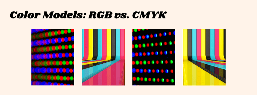
In print design, the CMYK color mode is used (cyan, magenta, yellow, and key/black). This is because printers mix these four colors of ink to create a full range of colors on paper. When designing for print, it’s important to select colors that can be accurately reproduced in the CMYK spectrum, as some vibrant colors (like neon greens or bright blues) may not print as vividly as they appear on screen.
Digital:
For digital design, the RGB color mode (red, green, blue) is used because screens emit light using these three colors. RGB can produce a wider range of colors than CMYK, which is why the same design may look different when viewed on a monitor compared to a printed version. It’s crucial for digital designers to work within the RGB color palette to ensure the colors you see on your screen match how the design will appear on digital devices.
Print:
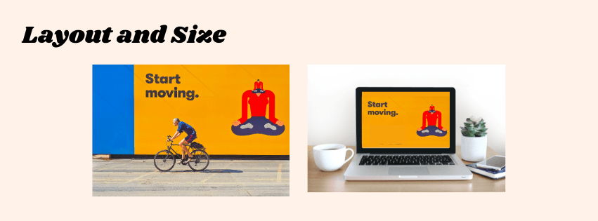
Print designs are typically produced in fixed sizes and formats, which can range from business cards to billboards. One of the most important things to consider in print layout is how the final piece will be physically handled. You need to account for bleed, which is the extra area around the edges of your design that ensures no unprinted space appears after trimming. Margins are also more important in print to avoid important elements being cut off during the trimming process.
Print designs should be designed with the assumption that viewers will engage with them at a specific distance—whether that’s holding a flyer in their hand or looking at a large poster from a distance.
Digital:
Unlike print, digital designs need to be responsive and adaptable. Your layout should be flexible enough to work across various devices, such as smartphones, tablets, laptops, and desktops. Designers often use a grid system to ensure consistency, but digital layouts can also incorporate fluidity to resize appropriately depending on the screen size.
You also have to consider user interaction. For instance, in web design, the layout must support intuitive navigation, and in app design, buttons and touch elements must be placed for ease of use.
Print:
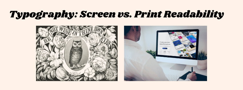
Typography in print design can be more elaborate and decorative. With high-resolution print and the ability to control the medium, you can use serif fonts, intricate letterforms, and fine details that might not be legible on a screen. Print designs are also less affected by screen glare or pixel limitations, which gives you more room for creativity.
Digital:
For digital designs, legibility is a priority. Because screens often have lower resolution, and users may be viewing content on smaller or lower-quality displays, fonts should be simple, clear, and easy to read. Sans-serif fonts tend to perform better on digital screens, as they’re cleaner and easier to read on lower resolutions. You also have to consider web-safe fonts, which are fonts that are supported across all devices and browsers.
Print:
Print designs are static, meaning once they’re printed, they can’t change or respond to the audience. The primary goal of print design is to communicate the message clearly and efficiently through visual elements such as color, typography, and imagery.
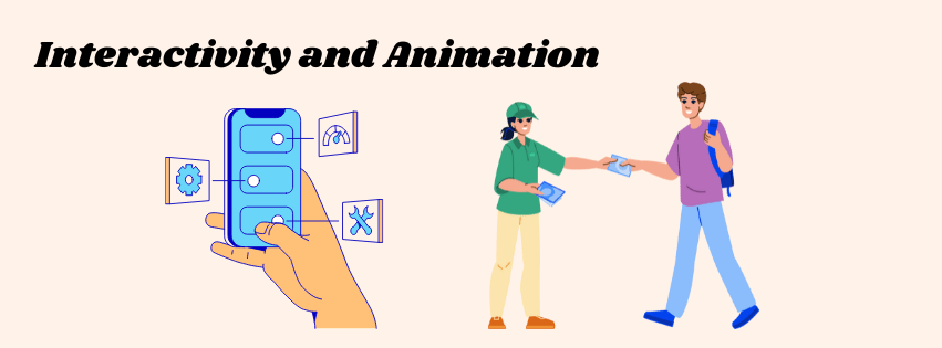
Digital:
Digital designs offer endless possibilities for interactivity and engagement. From clickable buttons and navigational menus to animations and videos, digital design can create dynamic user experiences. You can also use microinteractions, which are small animations that provide feedback to users when they click a button or hover over an element. These interactions are something print simply cannot achieve.
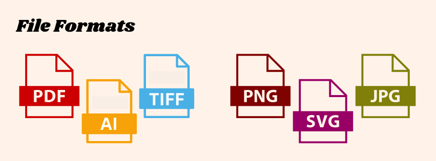
Print:
When designing for print, the preferred file formats are typically PDF, TIFF, and EPS. These formats preserve the high quality of the design and ensure that the colors, resolution, and typography remain intact when printed. If you’re working with vector graphics (like logos), AI (Adobe Illustrator) or EPS are common choices.
Digital:
For digital designs, the most common file formats are JPEG, PNG, GIF, SVG, and WEBP (for websites). These formats are optimized for fast loading times and web compatibility. For vector graphics, SVG is a widely used format because it scales well across devices without losing quality.

Print:
When preparing for print, you need to ensure that your designs are in the right color mode (CMYK) and have the necessary resolution (300 DPI). You also need to account for the material your design will be printed on, such as glossy paper, matte, or fabric. Always request a proof to ensure that the printed product matches your design expectations before going into full production.
Digital:
For digital design, testing is key. You should view your designs across multiple devices and browsers to ensure consistency. Screen size, resolution, and lighting conditions can all affect how your design is perceived. It’s important to check how elements look on different devices and ensure they are responsive and functional.

Designing for print and digital both have their unique challenges, but understanding the core differences will allow you to create designs that are optimized for their respective platforms. Whether you’re creating a brochure that will be printed on high-quality paper or a website that’s viewed on thousands of different screens, always keep these distinctions in mind to ensure your design is both effective and visually appealing.
Do you have any specific questions or tips about designing for print or digital? Let me know in the comments!
 Rebecca Branton
Leave a comment