
From hand-drawn maps of the ancient world to interactive dashboards powered by AI, the world of data visualization has undergone a dramatic transformation. As visual tools have grown more powerful and accessible, the question isn’t just what we can visualize, but how well we can do it.
In this post, we’ll explore the pros and cons of technological advances in data visualization, define what makes a good chart, and reflect on which design elements truly resonate by drawing insights from A Brief History of Data Visualization and Heavy.AI’s breakdown of modern visualization practices.
Pros and Cons of Technological Advances in Data Visualization
Technology has revolutionized how we work with data. Today, widely accessible platforms and libraries allow users to generate compelling visuals from massive datasets in minutes. Real-time dashboards powered by GPUs or AI can surface patterns and anomalies across millions of rows of data, which was inconceivable just a few decades ago.
Key advantages:
- Speed and scale: With modern tools, vast datasets can be filtered, visualized, and shared in real time, making data exploration faster and more accessible than ever.
- Interactivity and accessibility: Visualization is no longer confined to experts. User friendly platforms allow anyone to create data stories and dashboards.
- Insight generation: By turning raw data into shapes, colors, and movements, visualizations can reveal trends and relationships that would be missed in tables or code.
Yet, with great power comes risk. These advancements also bring challenges:
- Misrepresentation: Flashy visuals can distort or oversimplify, whether through poor scale choices, misleading color gradients, or biased data ranges.
- Overload: Modern dashboards can be overwhelming. When everything is interactive, dynamic, and animated, it’s easy to confuse more visuals with more meaning.
- Tool dependence and skill gaps: While platforms are powerful, they often require specialized skills. Businesses may struggle to balance tool investment with training.
Ultimately, technological progress is a double-edged sword: it amplifies our ability to create successful visualizations, but also our capacity to obscure them.
What Makes a Good Chart?
A good chart doesn’t just look appealing; it communicates clearly, accurately, and with purpose. Drawing from both historical examples and modern best practices, we can distill the qualities of effective visualization into four areas:
- Clarity
Strip away excessive labels, decorative elements, or 3D effects that distract from the meaning. A good chart should be readable at a glance with a clear title, labeled axes, and intuitive legends. - Accuracy
The visual elements (position, length, area, or color) should match the data type and scale. Misleading axis scales, disproportionate pie charts, or mismatched color schemes can all skew interpretation. - Context
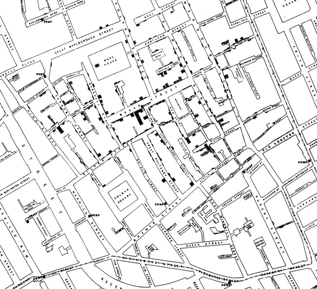
Every chart should tell a story. Whether it’s Florence Nightingale’s coxcomb diagrams or John Snow’s cholera map, the best visuals provide enough background via labels, annotations, legends, keys, or captions for readers to draw valid conclusions.
4. Appropriateness
Choose the right chart type for your data and purpose. Are you working with time-based data? Use a line chart. Distribution? Try a histogram or boxplot. Relationship? Go with a scatterplot.
One historical standout that exemplifies these principles is Charles Minard’s 1869 chart of Napoleon’s disastrous march on Russia. It’s a multivariate masterpiece showing geography, temperature, time, and troop size all in one clear visualization.
What I Respond to in a Good Chart
Personally, the charts I respond to most strongly are those that balance simplicity with depth. I want to grasp the story instantly, but also drill down for more meaning.
Take a scatterplot, for example. With clear labels, a logical scale, and minimal distractions, it allows me to instantly see relationships like clusters, trends, or outliers without any verbal explanation. This taps into our brain’s natural ability to recognize visual patterns, leveraging position and spacing as perceptual strengths.
Recently, I spent more time than I’d like to admit exploring an interactive webpage of 100 Years of Rock. Mapping out essentially every music genre is no small feat, but a simple timeline with boxes placed throughout to show when each genre was born gives the viewer a simple overview of the data.
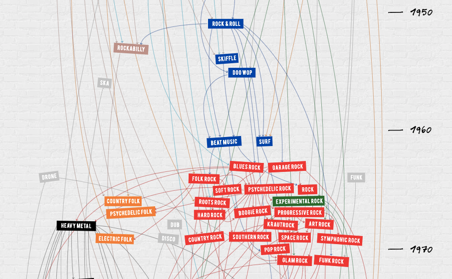
It wasn’t flashy, but it was effective. I could immediately tell where genres began and how they correlated with other genres. That’s what makes a visualization memorable; it delivers insight without cognitive overload.
Final Thoughts
The history of data visualization is a story of progress, but also of restraint. As we gain more tools and data, the real challenge becomes designing charts that clarify and reveal rather than confuse and distract.
A good chart isn’t about looking modern, it’s about being meaningful. In a world flooded with visual noise, clarity is more powerful than ever. The best visualizations don’t just show data in a fancy way, they show the truth.

Leave a comment