In the world of visual communication, it’s not enough to just create pretty charts and hope the viewer can decipher what it means. To be effective, visuals must be tailored based on what you’re showing and why. Is this visualization based on conceptual ideas or real data? Are you teaching or exploring? To create a successful information visual, it is essential to know how to properly portray your data set.
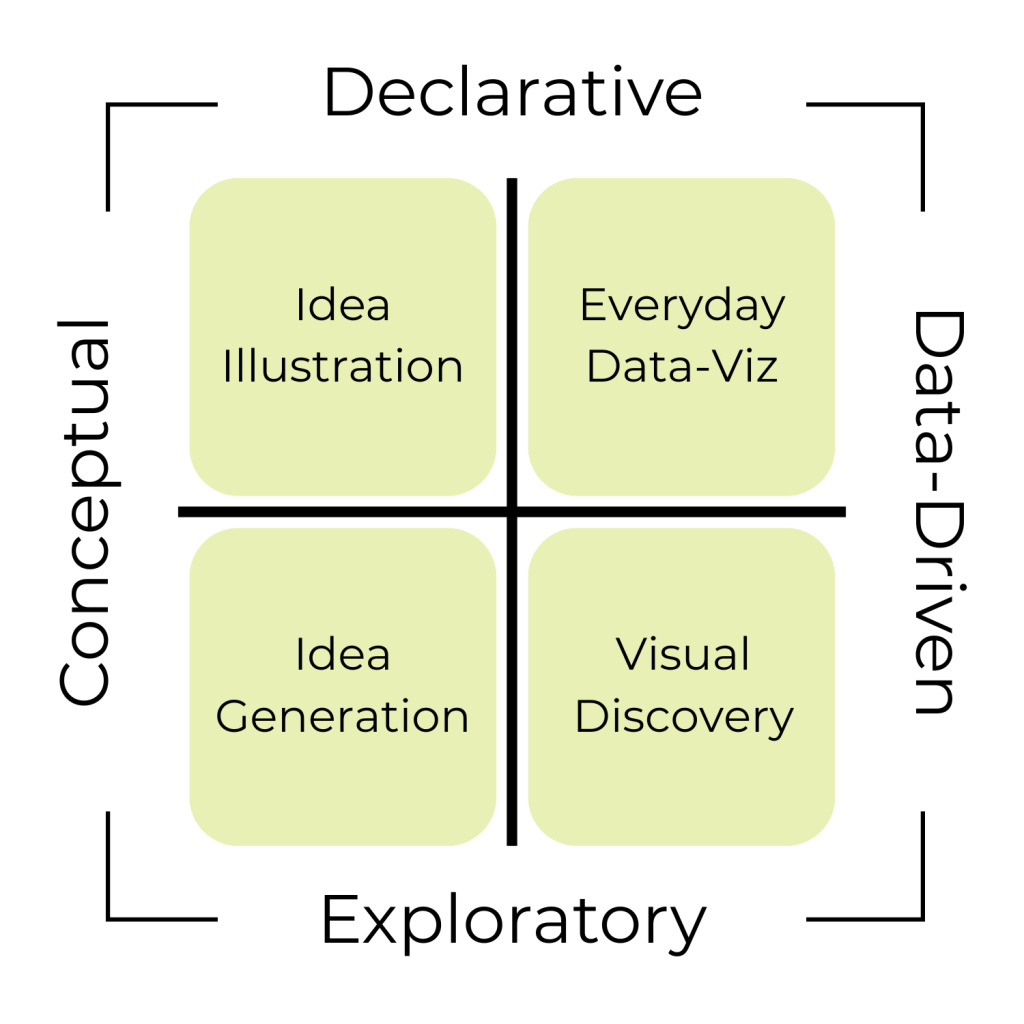
In his book Good Charts, Scott Berinato breaks information visuals into four categories:
- Conceptual‑Declarative (“Idea Illustration”)
- Conceptual‑Exploratory (“Idea Generation”)
- Data‑Driven‑Declarative (“Everyday Data‑Viz”)
- Data‑Driven‑Exploratory (“Visual Discovery”)
Before beginning to visualize your data, Berinato recommends asking yourself two questions: Is the information conceptual or data-driven? Am I declaring something or exploring something?
Let’s journey through each, with real-world examples and why they work.
Conceptual‑Declarative: Idea Illustration
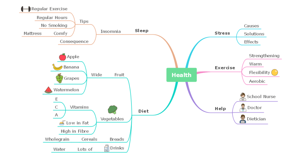
Conceptual-declarative visualizations are used to simplify complex ideas, frameworks, or processes without relying on precise data. Think back to middle school science class, and you’ll likely picture several examples of conceptual-declarative visualizations like health mind maps, cell diagrams, and animal kingdom flowcharts. When compared to conceptual-exploratory visualizations, conceptual-declarative takes a more linear, streamlined approach to illustrating information. This helps viewers understand how each aspect of the visualization fits into an overarching concept.
Why it’s effective:
- Visuals are instantly graspable
- Minimal text and no clutter focuses attention
- Linear layout
Conceptual‑Exploratory: Idea Generation
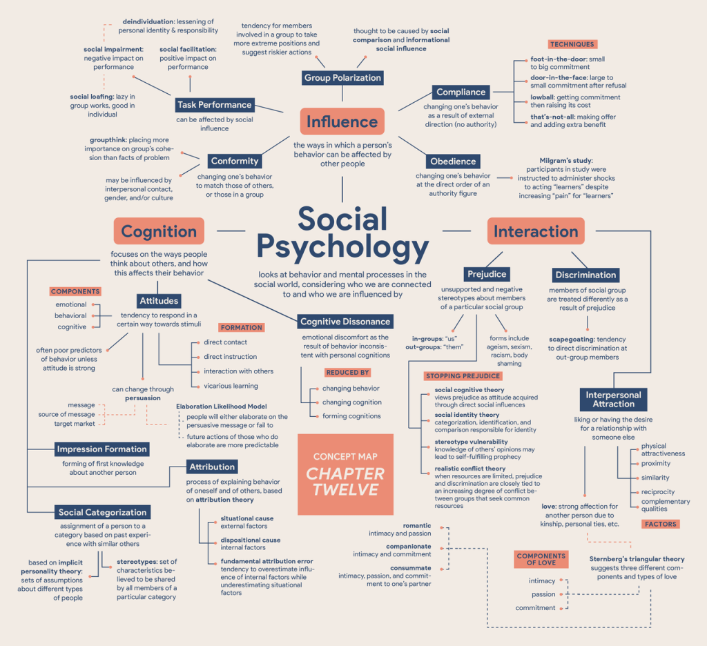
Conceptual-exploratory visualizations are used to help an audience connect concepts together and analyze their relationships. These visuals help you explore, think out loud, and discover new connections. This type of visualization is often interactive to encourage viewers to immerse themselves into the data rather than taking it at face value. When compared with conceptual-declarative, conceptual-exploratory visualizations require a more non-linear approach. This helps the viewer feel comfortable making connections with the information.
Why it’s effective:
- Free-form and flexible process encourages creativity
- Supports iterative thinking and ability to add, erase, and connect
- Fosters collaboration
- Non-linear layout
Data‑Driven‑Declarative: Everyday Data‑Viz
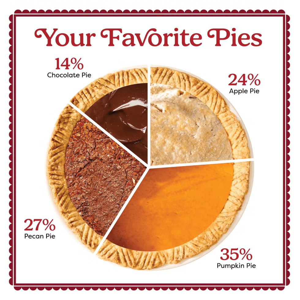
Data-driven-declarative visualizations are used to present specific data findings clearly. The aim is efficient communication, not exploration. Think of middle school again (more war flashbacks, I apologize); most of the charts and graphs you studied, such as bar graphs, pie charts, and line graphs, would fit into this category.
Why it’s effective:
- Familiar chart types (bar, line, pie) are instantly readable
- Highlights key data points
- Readers can absorb information without needing an explanation
Data‑Driven‑Exploratory: Visual Discovery
Data-driven-exploratory visualizations are used for deep analysis of large or complex datasets. The goal is to explore, discover patterns and trends, or identify outliers. Instead of highlighting each data point, this type of visualization encourages viewers to analyze the bigger picture.
Why it’s effective:
- Simplifies multiple variables
- Invites interaction to scan, zoom-in, and discover
- Works at multiple scope levels, such as overviews or detailed segments
When to Use Each Type
| Information Visual Type | When to Use |
|---|---|
| Conceptual‑Declarative | Present abstract ideas, simplify complex information |
| Conceptual‑Exploratory | Connecting concepts, analyzing relationships |
| Data‑Driven‑Declarative | Reporting, presentations, communicate key insights |
| Data‑Driven‑Exploratory | Explore and analyze large datasets, identify trends, patterns, and outliers |
By aligning what you’re visualizing and why, you can avoid misunderstandings that frustrate your audience.
- A conceptual audience doesn’t need 1,000 data points; they want clarity.
- Analysts exploring data shouldn’t be confined to static bar charts.
- The wrong visual halts insight or dilutes impact.
Final Thoughts
Effective visuals aren’t about fanciness; their success depends on how well they convey certain information. Understanding concepts vs. data and declarative vs. exploratory helps you communicate ideas clearly, encourage analysis, and reveal data insights successfully.

Leave a comment