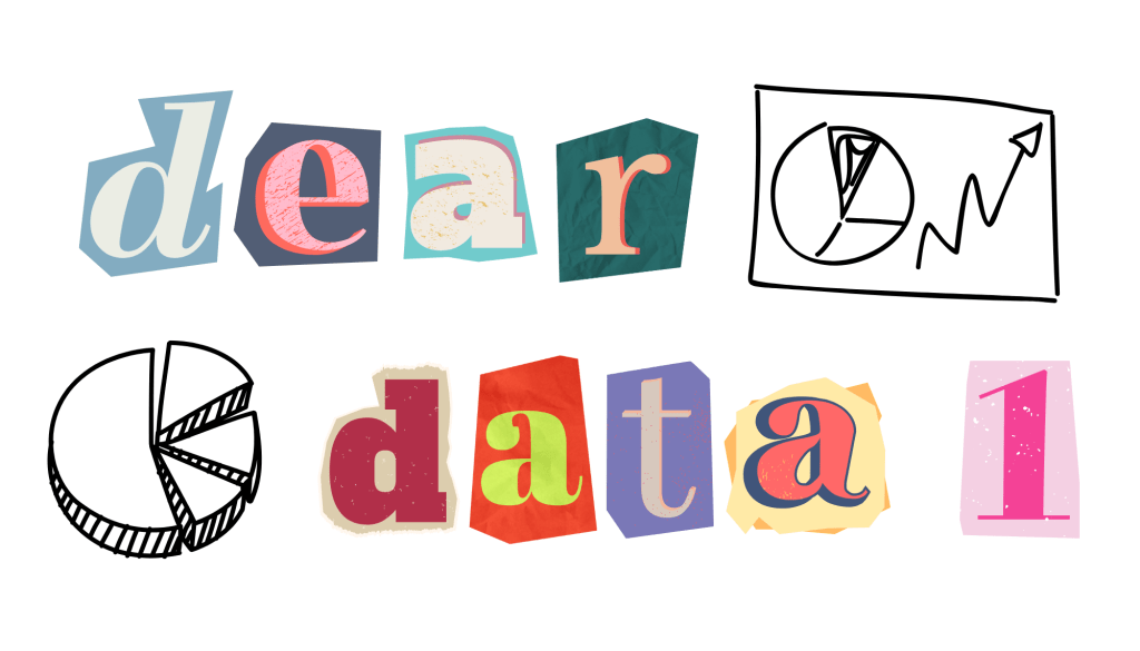
In an era where data is often seen as cold, complex, and strictly scientific, Dear Data offers a refreshingly human take on what data can be. Created by information designers Giorgia Lupi and Stefanie Posavec, this year-long data visualization project redefines data as a personal form of storytelling and connection.
The Process
The premise was simple but profound. Each week, Giorgia in New York and Stefanie in London would collect data on a specific aspect of their daily lives. Then, they would each transform that data into a hand-drawn postcard visualization and send it to the other. Every card included a legend that explained the drawings, making it a visual diary of their experiences.
The Result
What makes Dear Data so compelling is how it challenges our understanding of what data is for. Typically, data is used to analyze trends, make business decisions, or inform policy, but Giorgia and Stefanie used it as a tool for introspection and friendship. By tracking the seemingly mundane, they uncovered patterns that spoke volumes about their habits, emotions, and even cultural differences.
One of the most striking things about the project is its emphasis on slowness and intentionality. In a world dominated by fast digital communication, it embraced the analog. The physical act of writing, drawing, and mailing each postcard became a meditative process. It invited both artists to slow down and reflect on their weeks, paying closer attention to their environments and behaviors.
This approach also highlighted the beauty of imperfection. Unlike the slick graphs and dashboards we see in tech presentations, each postcard was delightfully imperfect. The hand-drawn symbols and playful colors carried a warmth that made the data feel alive. This collaboration serves as a reminder that data doesn’t have to be sterile; it can be deeply expressive and human-centered.
In the end, Dear Data isn’t just about data visualization, but about connection. It asks us to see data not just as something we extract and analyze, but something we live. Through curiosity and creativity, it shows how even the smallest details of our lives can become meaningful when shared.
My Turn!
Inspired by Lupi and Posavec’s collaboration, I recently collected data on a seemingly mundane part of my daily routine: dishes. Instead of just going through the motions, collecting this data encouraged me to look for emerging patterns and analyze my daily behavior.
I kept track of how many dishes were used each day by logging them into a simple table before loading the dishwasher. I made note of who produced the dirty dish, me or my partner, with a colored dot next to each dish type. Once compiling all the data, I created a pictograph of this past week’s dish usage.
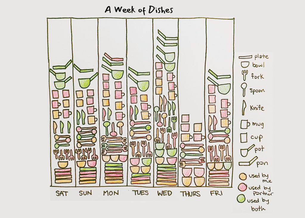
After creating this graph, I began to think of any variables that may have affected the number of dishes my partner and I used. More dishes were dirtied on Monday and Wednesday, which is when my partner made us dinner; I think he should have to do the dishes after he cooks if he’s going to use so many dishes! Thursday, the day with the least dishes, is a result of us going out to eat and playing trivia.
This project was eye-opening in many ways. Days with more than two mugs used are a result of me eating ice cream out of a mug instead of a bowl. I didn’t realize I go back and forth each day! It’s also safe to say that we have way more dishes than we actually use. Now that the data is collected, I’ll always be mindful of the dishes I produce and what daily variables influence my choices.

Leave a comment