
Data visualization has become an essential tool for communicating complex information in a simple and engaging format. Among the many platforms available, Datawrapper is one that stands out as a user-friendly and powerful tool for creating a wide range of visualizations, including interactive maps. To further expand my understanding of what it takes to present data successfully, I spent the week experimenting with maps on Datawrapper to bring geographic data to life.
Datawrapper offers several types of maps, including choropleth maps, symbol maps, and locator maps. Each serves a unique purpose and is suited to different kinds of data. Choropleth maps are useful for showing how a variable, such as population density or election results, varies across geographic areas like countries, states, or counties. Symbol maps allow users to place circles or other shapes on specific locations to represent quantities, such as the number of COVID-19 cases in cities. Locator maps are best for giving geographic context to a specific location, such as where a news event took place or where a company has its headquarters.
Experimenting with these map types begins with selecting the appropriate template. Once the user uploads their data, Datawrapper automatically recognizes these locations and plots them accordingly. The real power of the tool lies in its customization options. Users can change the color schemes, adjust the scale, label features selectively, and even control the zoom level and borders of the map. These design choices can greatly affect how the information is interpreted.
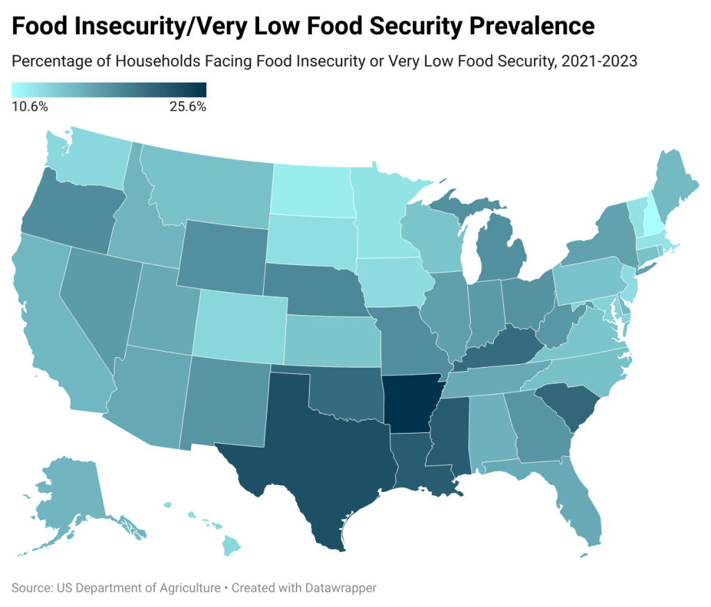
After familiarizing myself with the map types and customization options, I decided to try my hand at creating a few maps. The first type of map I created was a choropleth map depicting food insecurity levels in each state. After finding an Excel sheet from the USDA and cleaning up the spreadsheet, I imported it into Datawrapper and adjusted the map accordingly.
A key part of the experimentation process involves understanding how data and design intersect. For example, when creating a choropleth map, the choice of color gradient can either highlight subtle differences or obscure them. A red-to-green scale might intuitively communicate positive and negative outcomes, but it may also be problematic for those with color blindness. Datawrapper addresses such issues by offering colorblind-safe palettes and detailed customization options. Experimenting with these settings allows creators to test how different audiences might perceive the same map.
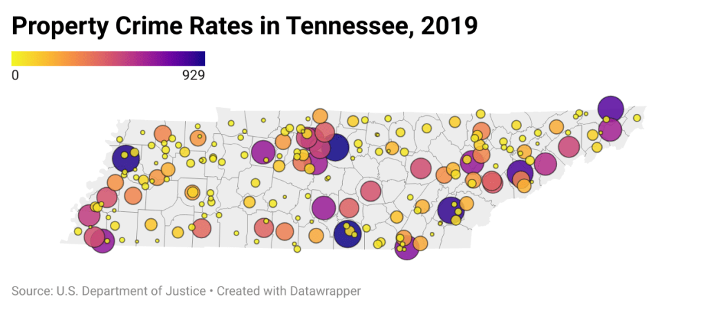
The next map type I experimented with was a symbol map. This allowed me to show the relative scale of data related to its location. This also gave me a chance to look deeper into the color options and choose one that reflects the data in an approachable way.
Datawrapper’s live preview feature is another helpful aspect of the experimentation process. As users make changes, they can instantly see how the map updates. This immediate feedback encourages trial and error and makes it easier to iterate toward a clearer, more compelling design. Users can also embed maps in websites or export them as images or PDFs, making them highly versatile for presentations, reports, or digital media.
Another interesting area for experimentation is combining maps with storytelling. Datawrapper allows users to add annotations, titles, and descriptions directly onto the map. By doing so, users can guide their audience’s attention and provide context that transforms raw data into a narrative. This feature makes maps not just visual aids but storytelling tools in their own right.
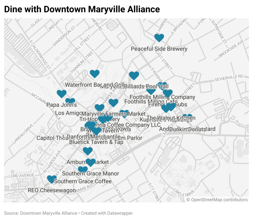
The last map I made was a locator map depicting the dining options in Maryville, Tennessee. This data was collected from Maryville’s Downtown Alliance, which made inputting the data manually a streamlined process.
After spending some time with the program, experimenting with maps on Datawrapper is an excellent way to deepen your understanding of both data and design. It acts as a simple step into the world of geographic data visualization and encourages critical thinking about how to communicate information effectively. Whether for journalists, researchers, or students, Datawrapper empowers users to turn any data into insight.

Leave a comment