When beginning the process of design, it’s easy to picture an ultra-rigid, scientific method that you need to stick to in order to be successful. Great news – this isn’t the case at all. Like I’ve mentioned before in other posts about design thinking, it is human centered. Empathy is the first step in understanding what a user needs and how you can provide them a meaningful, positive experience.
Design Psychology
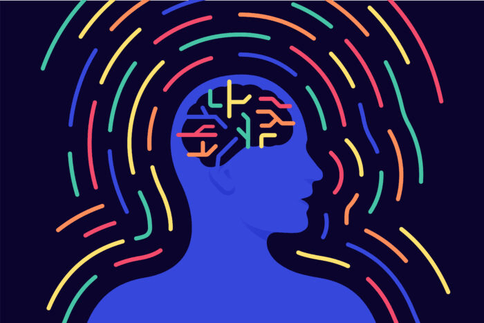
To dive into this idea further, forming an understanding of how people feel in response to what they need is step one. Design psychology is the bridge needed to connect users and designers.
Design psychology involves “neuroscience, cognitive psychology, social psychology, and human-computer interaction that approaches user experience design through the lens of human behavior.”
Ishan Manandhar, The Psychology of UX Design
In the most basic sense, you need to put yourself in your user’s shoes. Identify any emotional motivators you think would compel someone to continuously return to your design. What do they need? How are they going to feel about the choices you might make?
3 Stages of Emotional Response
Don Norman, a contemporary designer, shared with Forbes the three categories he has broken down users’ reactions into:
Visceral – The most basic human response; a user’s first impression.
Behavioral – When users evaluate the functionality of a product.
Reflective – When users compare the pros and cons of a product and form their overall impression of a design.
These categories can be used to further identify the feelings a user may have toward your product. Each category is important in it’s own way and lets the designer in on the thought process of their user.
Website Analysis
I recently completed a website analysis comparing Ulta and Sephora to better understand design psychology. I’m a makeup lover and was curious to see how my experience shopping online would compare to shopping in person. I took on the role as the user and documented my feelings and needs toward each website. I gave myself one task: find and add a Too Faced concealer to my cart.
I began with Ulta’s site. This is where I typically shop in person, so investigating their online presence sounded like a treat. With each click, I created feel/need statements that described how I felt throughout the process. For example, I stated that the homepage of Ulta’s website makes me feel curious and excited because my need for organization and unity was met.
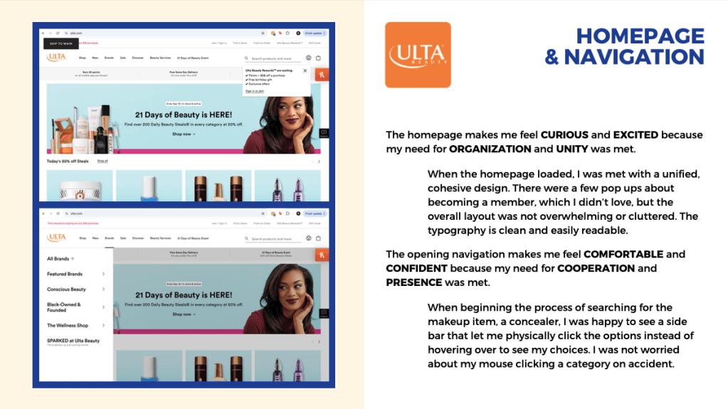
These feel/need statements are a simple way to gather information from your user in a concise manner. Despite feeling almost elementary, they directly provide a designer with what is and is not working for users. In my experience, Ulta’s website was concise, organized, and enjoyable to navigate overall.
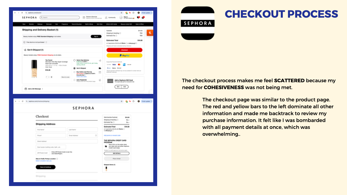
Once I finished my task on Ulta’s website, I repeated the steps with Sephora. I quickly noticed that I didn’t feel as confident on Sephora’s website. This may be because I don’t typically interact with this brand in person, but the website left me overwhelmed and less likely to browse freely.
To see my full analysis, you can access the document here.
Overall, I enjoyed exploring two competing websites to get a better idea of what I prefer as a user. Whether consciously or not, everyone has unique preferences to what they look for in user design. What I prefer might not be your cup of tea, and that’s okay. As long as designers put humans first, products and platforms will continue to reach their greatest potential and provide users meaningful experiences.

Leave a comment